How to Create Beautiful iOS Charts in Swift | iOS Tutorial

Presenting data through graphs and charts is one of the most remarkable features of mobile applications today. iOS Charts make apps look more beautiful and noticeably more attractive. We already integrated a number of Swift Charts into many mobile app templates such as the Dashboard iOS App Template or Personal Finance iOS App Template.
In this tutorial, we’ll show you how we implemented our iOS Charts in Swift, with code examples. We’ll be taking a look at Swift line charts, pie charts as well as bar charts.
You can find many libraries that support displaying charts and one of them is Charts of Daniel Cohen Gindi. And in this article, we will study how to display charts, how many types of charts, and how to customize them.
1. Introduction
Currently, it has become one of the most prominent features of most fitness apps or any enterprise apps that provide tracking, checking and comparison of user’s data. Displaying data in a tabular or collective view can be boring and gives limited data visualization capabilities. And since then, the integration of charts in iOS applications is a thing that should be done in these cases.
Mega Bundle Sale is ON! Get ALL of our React Native codebases at 90% OFF discount 🔥
Get the Mega BundleDepending on our purpose, we choose which type of Swift chart is most appropriate for our iOS features:
-
Bar Charts: When data has different categories and needs a comparison (Monthly Sales Values, for example) a Bar Chart provides a good and straightforward visualization.
-
Pie Charts: When categorical data needs to be shown in percentages, pie charts (a.k.a circle charts) will be a good choice. Each chart always represents the whole, thus, must be equal to 100%.
-
Line Charts: To visually represent changes over a certain period of time, such as inventory, there is nothing better than using Line Charts. It shows the maximum and minimum points and shows the current status of the company.
2. iOS Pie Charts in Swift
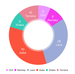
In this tutorial, we will build an iOS application showing the percentages of goals that players have contributed to their football club. As you probably have guessed already, a Swift pie chart would be the best way to visualize this kind of data, in an iOS native app.
And let’s get started. Download the Swift starter project here and run it in Xcode. Basically, it has three buttons corresponding to each of the three types of charts. When you tap any buttons, it pushes a screen that displays the desired chart.
As usual, we need to install the dependency library, which in this case is Charts. You can download it manually or via Podfile (recommended – this is what we use) or Carthage. We prefer the Podfile because it’s fast, neat and clean. And we also created the Podfile (with pod Charts) already, so you just need to run the **pod install** command in the terminal. Then, let’s run the Xcode project for the first time. It looks like this:

Step 1: Set up the UI and IBOutlets
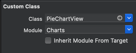
By using the Interface Builder, drag a View object to your storyboard. Remember to set constraints for it, using auto layout. Then, at the Identity inspector part, you choose PieChartView, from the Charts module. It looks like this:
After that, we need to drag an IBOutlet connection from the View on the screen to the UIViewController that manages the PieChartView. Keep in mind to import the Charts library in order for the code to compile successfully.
Step 2: Create mocking data
Next, we will create a file called “CommonData”, which includes the player’s name and their respective number of goals for the club.
let players = [“Ozil”, “Ramsey”, “Laca”, “Auba”, “Xhaka”, “Torreira”]
let goals = [6, 8, 26, 30, 8, 10]
Mega Bundle Sale is ON! Get ALL of our React Native codebases at 90% OFF discount 🔥
Get the Mega BundleThen, we are going to create a function displaying all these data and put it inside viewDidLoad() like this:
override func viewDidLoad() {
  super.viewDidLoad()
  customizeChart(dataPoints: players, values: goals.map{ Double($0) })
}
func customizeChart(dataPoints: [String], values: [Double]) {
  // TO-DO: customize the chart here
}
That function is customizeChart with dataPoints and values parameters. Because the “values” parameter is Double, so we need to change the goals array from Int type to Double type. Now what we need to do next is to customize the chart as we want.
Step 3: Customize the chart
Before showing you the code, we want to talk a little bit about the theory. You should know some of the following properties:
-
ChartDataEntry: This “ChartDataEntry” property will store the values of each element that we need to represent in our array.
-
ChartDataSet: This ChartDataSet will use the information from the array of ChartDataEntry objects to custom how to display them on the screen.
-
ChartData: This ChartData will use the ChartDataSet as the chart’s data.
Mega Bundle Sale is ON! Get ALL of our React Native codebases at 90% OFF discount 🔥
Get the Mega BundleNow let’s see how it works
func customizeChart(dataPoints: [String], values: [Double]) {

  // 1. Set ChartDataEntry
  var dataEntries: [ChartDataEntry] = []
  for i in 0..<dataPoints.count {
    let dataEntry = PieChartDataEntry(value: values[i], label: dataPoints[i], data: dataPoints[i] as AnyObject)
    dataEntries.append(dataEntry)
  }
  // 2. Set ChartDataSet
  let pieChartDataSet = PieChartDataSet(values: dataEntries, label: nil)
  pieChartDataSet.colors = colorsOfCharts(numbersOfColor: dataPoints.count)
  // 3. Set ChartData
  let pieChartData = PieChartData(dataSet: pieChartDataSet)
  let format = NumberFormatter()
  format.numberStyle = .none
  let formatter = DefaultValueFormatter(formatter: format)
  pieChartData.setValueFormatter(formatter)
  // 4. Assign it to the chart’s data
  pieChartView.data = pieChartData
}
Let’s analyze the code:
-
For each player and the goals he has, we set it to PieChartDataEntry object — a subclass of ChartDataEntry. Then we save it inside an array of PieChartDataEntry type.
-
The PieChartDataSet — a subclass of ChartDataSet will use this array to custom how to display them on the screen. For example, this line of codepieChartDataSet.colors will set colors for each part.
-
The PieChartData — a subclass of ChartData will store the PieChartDataSet. At this point, you can change the format of values which will be shown on the screen such as 15 instead of 15.0.
-
After we have done setting up everything, we assign the pieChartData to pieChartView.data
Also, if you have the design for each specific color and you know the exact number of entries, you can create and select colors for them. In this app, we’ll choose random colors for it and the number of colors depends on the number of items.
private func colorsOfCharts(numbersOfColor: Int) -> [UIColor] {
  var colors: [UIColor] = []
  for _ in 0..<numbersOfColor {
    let red = Double(arc4random_uniform(256))
    let green = Double(arc4random_uniform(256))
    let blue = Double(arc4random_uniform(256))
    let color = UIColor(red: CGFloat(red/255), green: CGFloat(green/255), blue: CGFloat(blue/255), alpha: 1)
    colors.append(color)
  }
  return colors
}
Mega Bundle Sale is ON! Get ALL of our React Native codebases at 90% OFF discount 🔥
Get the Mega BundleNow, let’s run and see how beautiful our chart is.
3. Other charts
As we said at the beginning, each chart has its own advantages. The line charts and the bar charts may not meet the requirements of the current app. However, we will still create these two iOS charts to show you that they can be easily created using the same simple steps.
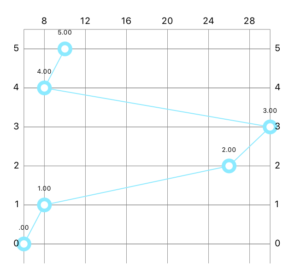
a. The Swift Line Chart
var dataEntries: [ChartDataEntry] = []
for i in 0..<dataPoints.count {
  let dataEntry = ChartDataEntry(x: values[i], y: Double(i))
  dataEntries.append(dataEntry)
}
let lineChartDataSet = LineChartDataSet(values: dataEntries, label: nil)
let lineChartData = LineChartData(dataSet: lineChartDataSet)
lineChartView.data = lineChartData
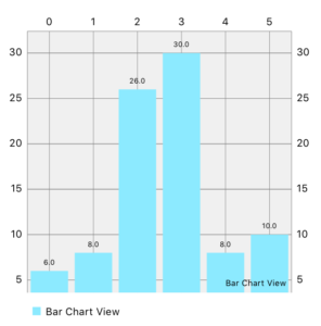
b. The Swift Bar Chart
var dataEntries: [BarChartDataEntry] = []
for i in 0..<dataPoints.count {
  let dataEntry = BarChartDataEntry(x: Double(i), y: Double(values[i]))
  dataEntries.append(dataEntry)
}
let chartDataSet = BarChartDataSet(values: dataEntries, label: “Bar Chart View”)
let chartData = BarChartData(dataSet: chartDataSet)
barChartView.data = chartData
Looking for a custom mobile application?
Our team of expert mobile developers can help you build a custom mobile app that meets your specific needs.
Get in TouchConclusion and iOS Charts Challenge
After all, we hope this article provides a clear overview of the iOS Charts. They make your mobile app more beautiful and attractive. Besides core functions, application UI/UX should also be prioritized, to provide a better user experience.
Before we finish this article, we have some challenges for you:
-
This library has also some touch events, so you could give a try on this part.
-
For the BarChartView, inside viewDidLoad(), we left some lines of codes as a bonus. You can play around with them.
Here is the completed Swift source code. Hopefully, you learned how to build iOS Charts in Swift, so that you can make your Xcode projects more attractive. We hope you found this Swift tutorial useful, so please sharing it out to spread the word. Don’t forget to do your challenges. Happy coding!